Saturday, 9 April 2016

18th February to 9th March - Preliminary Task

The preliminary task was "film a person coming into a room, having a conversation with another person with a reverse shot", and since I had done this task last year for my GCSE coursework, I decided when filming this to be quite a bit more ambitious with it. Basically, give myself a broad enough scenario where I could allow myself to mess around in editing, see what I could discover with Sony Vegas.
Starting on February 18th, I began the scripting process for my preliminary task. As shown by here, not much substance, but what it allowed me to do was give me creative freedom later down the line. This script would later go on to not be the final one, because of some technical difficulties and need to pad the length out a bit. It had no plot, it just allowed ambition.
Next was storyboarding, immediately after finishing the script. It came to a total of around six different shots, due to the length. The first shot showed what was happening without revealing too much. The second had Man's face revealed and speak, giving a feeling. The third revealed Man2, fulfilled reverse shot and provided a contrasting difference from mid-long shot to long shot. Fourth and fifth were both close ups where I had an idea of something experimental I wanted to do in editing. I wanted to see if I could have a second shot overlay half the screen, clearly split in the middle because it would show the synergy of the two characters. I gave up on this idea during editing, because I couldn't work it out. Finally, shot 6 was a high-angle of both Man and Man2 walking down a hallway with the cameraman staying equidistance away as they sung Firework.
Filming was relatively quick, not much to say, had everything in 40 minutes. Editing was the hard part because I realized how mediocre the audio was on some clips, and how mediocre the camerawork was on others. This is where I made the big decision for this task of keeping all the ones with good camerawork, and removing all audio, turning it into a silent film. How I achieved this effect is through the use of filters on each shot to make it look more like it was developed in the early 1900's. To replace the audio, I removed each clips current audio and put in a fairly old light-hearted track "Kevin MacLeod - Look Busy" and for all the dialogue, after any shot containing some I put a black screen with a fancy white border with the dialogue in text form on top. This would also have a filter placed on top of it. At this point, I knew that I wanted some more experience with non-live-action stuff, so at the end of the previous shots, I added in a record scratch as the Youtube Copyright infringement message appeared, so I could do a short joke parodying The Fine Bros. The Fine Bros were quite topical at the time, for trying to trademark "React" videos and striking any video with the word "React" in it. The joke became The Whine Bros due to the pun and it was useable because I was going on the assumption that the audience would have a reaction to the earlier half. This led me to get in contact with one of my friends who could record audio and I used our mascots commonly associated with our online personas to represent that. This was mainly to test my usage of moving images through the editing process. As it zoomed in to a black and white version of the message, specifically the face, I had Gary Jules - Mad World playing because that's a song commonly used for "edgy" things on the internet. Overall, I think this task could've been done better, but I did what I set out to do at least.

YouTube URL: https://www.youtube.com/watch?v=g72odeR69Fo

Conceptualizing Mockumentaries

First off, I made a storyboard with a few ideas for my final piece. Understandably, not many of them stood as I made a list of positives and negatives for each of them but I managed to narrow it down to four I liked above the rest.


Animade A Plan: Disclamer, history that sounds odd despite nothing actually being wrong, interview with anime watcher watcher, hint at their death and link to schools, end up at Comicon

The Friendly Island: Disclamer making it sound like the most horrific thing known to man, parody of We're Back, narration of a similar story to TLI's rise to fame, have shots showing their progression

Virtual World Problems: Disclamer, introduce myself, background info, where it's gotten me, guests talking about areas (Tommaso (Italian), Rabbid (gaming), Lotus (anime), Muffin (Facerig)), show either Smash or Undertale, fail at it, say the title, show the title
The last idea was the one that stuck the most. namely because of the concept for it which was "A mockumentary based on how fictional media influences people". This concept explores an area I'm incredibly familiar with, considering my main hobbies are gaming, watching anime, etc. As such, I could come up with a lot to say about it and that would make scripting a whole lot easier. My target audience would be people who also share love of a media product, niche 16-35, and it's scenario would be "Exploring how Media Products have influenced lives".

Wednesday, 2 March 2016

11th Febuary - All You Need Is Cash (The Rutles) Analysis

All You Need Is Cash is a mockumentary based on The Rutles, a British Rock Group that has resemblance to The Beatles which is "purely - and satirically - intentional". The Rutles are just a parody of the Beatles and the events and songs featured in this film are parodies as well. Eg. Yellow Submarine is Yellow Submarine Sandwich and Get Back is Get Up And Go. What I classified as the opening for this one is when the first song ends, the titles have been shown and we have our explanation of who the Rutles are. https://www.youtube.com/watch?v=TA7bYjCbfX4
--------------------------------------------------------------------------------------------------------------------------
 At the start of the film, we are met with a mid shot of screaming girls, not in terror but joy. Before we even see the group we know they're a big deal, because of just the sheer happiness the fans seem to have. The audio is diegetic screaming that bridges into non-diegetic when the shot freezes. The moment the shot freezes captures the expressions of the fans, emphasizing what I mentioned before. Everything before the title is in black and white, which from a timeline standard makes it believable if we're considering The Rutles follow the same basic event structure of The Beatles. This should be the early days of the Rutles, which for the Beatles was 1960. Color TV's didn't become mainstream till mid 60's, early 70's, so it makes sense for this to be in B&W. The shot then swipes to long shot of a plane, which we could believe has The Rutles within. This swipe allows them to transition in a way that isn't a straight edit but also isn't a scene transition, just changing perspective. It then goes to a crab shot of more screaming fans before freezing again, but this time its a close-up and the fans are behind a gate. With how close they are to the gate, it has the illusion of busting out of jail which shows the determination of these fans. Non-diegetic music has just started to fade in, which sound like The Beatles song Get Back. When you listen to the lyrics however, you can tell it has the exact opposite meaning, as this isn't Get Back but a parody of it called Get Up And Go. The Rutles themselves have had a lot of songs made for them that are straight up parodies of Beatles songs, which provide humour due to the different meanings of the song and because it plays with expectations of what you think the song will be.

The freeze frame then swipes to a long shot of the planes nose opening, not something you see often and since the audience can see that part of it that is opening, it creates a bit of suspense as to what's inside even though they can probably work out what it's going to be. When the shot turns into a long shot that zooms into become a mid shot of the front of the aircraft, we can see the door the Rutles are there, smiling and waving. This sells the audience that they are a big deal, because they act like they are. We're also sold on it by the reaction in the next shot, where the fans are smiling and waving back. The screaming is still there, but not as loud, to continue believability. It then cuts back to the mid shot, with the Rutles jumping down and walking forward, leading into a freeze with the text "The Rutles" appearing on screen in red with a white outline. The colour red stands out on the B&W background, to draw more attention to how important he is.


The text fades out and then as the music follows, from top to bottom scrolls a mini introduction to The Rutles, an introduction done in a humorous way. The first half of it is a joke on how every group these days are called living legends, so they incorporated "living" and "legend" into every way possible in the sentence. It's funny because it's redundant and people just can't take it seriously. It's also helped by the way after that this story is called semi-legendary, making it sound underwhelming which is humorous in its own regard. The second half of the introduction comes down to the speed of the scroll, which is too fast for the narrator to keep up with, so he has talk fast to keep up. This is humorous because of how unnecessary it is. It takes something that could be very standard and changes one element to make it funny. The names of the Rutles are also said here and they create humour themselves because of how strong sounding 3 of the names are and how average the last one is: "Dirk, Nasty, Stig and Barry". As the text finishes scrolling "Get Up and Go" continues playing.


The entirety of the next shot is a gag, a forty second long one. I would say how the camera starts, but it isn't consistent, zooming in and out. We see the Rutles getting in a car to avoid fans, door shuts, immediately out that car the other side to get in another car, door shuts, out that car to get in the front of the van, shut the door, climb out the back, brush themselves down, get in a final car and then be driven away. The reason this joke works is because of how cartoonish it feels. It takes a fairly standard concept we expect, rushing into cars to be driven away, and plays with our expectation of what happens. The first time, it's funny because its unexpected. The second, it's funny because its even more unexpected when they already pulled that joke. The truck is an unexpected vehicle choice and going from front to back is also funny. The truck also gets laughs with the fact the lyrics at this time in "Get Up And Go" are about a truck. After getting out the back, you see them briefly slow down and wipe themselves down which creates humour in the fact they have time to clean themselves up a bit when they should be running. When they get in the final car, we see the number plate "Rut 1", which while it is part of Rutles name, it also provides humour because of "rut" having two definitions. "A long deep track made by the repeated passage of the wheels of vehicles", which is funny because they are in one. The other definition is "a habit or pattern of behaviour that has become dull and unproductive but is hard to change" which implies that things won't go very well. As they drive off text in similar fashion as before fades on saying the title "The Rutles in All You Need Is Cash". This title is a parody of a phrase commonly associated with The Beatles due to it being a title of one of their songs "All You Need Is Love".


The music then stops and we're taken to present day, where someone is introducing the Rutles and walking down a street while doing so. What starts of as an inherently normal scene, changes to become more comedic as it goes along. First off, the man is introducing them in a perfectly straight and normal way, but what he says is underwhelming and at points downright silly. Two examples are how the Rutles would "last a lunchtime" and "Their first album was made in 20 minutes. The second... took even longer." This is a clear parody of typical explanations that describe sensations by making them seem unimpressive or not giving us a solid idea because this entire line of dialogue is taking the mick. Apart from the dialogue, there's also humor obtained from the way the shot is filmed. It starts of as a tracking mid shot and follows aside the man. However, the camera is placed on a slowly accelerating bike, so the reporter needs to keep up with it. While it starts off at walking speed, eventually he needs to pick up the pace, to jogging, to running across the street when the bike goes to fast for legs to carry. This provides humor because it's not only ridiculous, but it's making fun of the shot usually used at this point in a documentary, which is usually slow paced and occasionally not engaging. It perfectly captures the mocking elements the genre is known for, while progressing the coverage at normal pace.
 -------------------------------------------------------------------------------------------------------------------------
What I've learnt from The Rutles is sometimes simple intros have the same effects as one's that have a lot of effort put into them. It depends how the simplistic nature is used. As long as it gets the point across, it's good. It also shows how a musical mockumentary should be done, with songs that aren't serious and a story that is ridiculous.

Friday, 26 February 2016

22nd January - Comic Book The Movie Analysis

The next film I'm analysing is not a mystery film but rather its a Mockumentary. The reason for this is because at this point I was starting to feel I didn't see mystery as the best option for me and I didn't want to not have all my heart in it because that would be visible in the final product, while with a mockumentary it allows me to take a different approach with a bigger focus on comedic elements that can be combined with others like mystery, if doing a "conspiracy" theory, and parody, all in the form of a documentary. As such, I wanted to research other mockumentaries to see what they do to achieve this effect and hopefully, be able to integrate similar ideas into my final product.
The opening of a mockumentary is interesting, as a lot of them have titles and then get on with the big thing, while some don't even have titles. As such, determining a stopping point is hard but what I classify the opening as is the point where initial exposition ends. We get an amount of backstory on what we're going to be watching, and that's our intro.
--------------------------------------------------------------------------------------------------------------------------
 
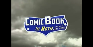
The film starts off with the scene of clouds sped-up moving in the back with text fading in and out across the centre before the title swoops in. Comic Book The Movie doesn't just talk about comic books, it directly parodies their style and this intro is very reminiscent of other comic book to film adaptations namely from the clouds and the sinister music, something that doesn't fit the tone of the film but matches the theme it covers. The credits also bring that vibe with the bold yellow colouring with a light black outline and shading, the boldness primarily reminding me of other superhero titles and even of the onomatopoeia seen to simulate action in comics. It also looks similar to the Comicon logo in terms of colours, shade and font. The music quickly contrasts as the title flies on screen into a sort of child-like tune complete with slapstick sound effects as parts of it fly on to it. This change says to me that the film understands how these superhero stories made kids feel and this showed the transition. These stories filled with hardship and struggle made children admire and happy, they wanted to be these heroes and the music reflects the optimism of these kids. The logo vaguely reminisces the Batman logo, yet another reference to an established franchise. Contrasting blue and white also relates to the cloud background due to the sky and clouds colouring, which could potentially represents how free you feel with this  hobby, which in turn could be ironic due to how costly the hobby of being a comic book fan actually is. The text looks more dynamic as once it appears, the logo rotates, zooms in and swipes to change scene, the 3D-animation making the film seem grand, like any superhero film.
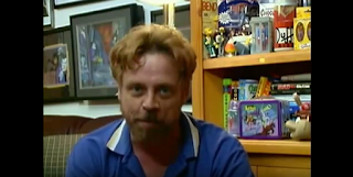
 
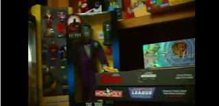
After the title swipes away, we're left with a camera shot of a man sitting down and telling us who he is, Don Swan. The mid-shot at a constant angle is very reminiscent of a vlog, where someone videos their life for entertainment purposes. The blue and white colour scheme comes back due to his shirt, which shows the link between comic books and Don, if that wasn't made obvious by his monologue and the Mise en Scene where you can see iconic comic book memorabilia, eg: "Duff" from The Simpsons.  From the introduction, very direct look at him, etc, we can tell that the documentary will centre around him.

It then goes to a couple still images separated by a fade. The first zooms out from the lower right corner, the second zooming out from centre. As this happens, Don is describing comic strips he obtained during his childhood which is a cliché of mockumentaries, the backstory is told as exposition rather than told as a story. The use of still images is reminiscent of internet vlogs because generally in vlogs, when a person mentions something they'll occasionally have an image up so people understand what they're talking about. These images are in black and white, which captures the "back-in-the-old-days" feel, which shows Don's experience with the media, meaning the audience has a bigger trust in this persons words.
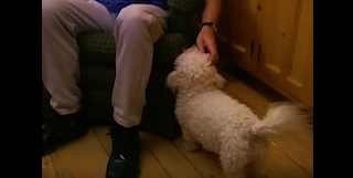
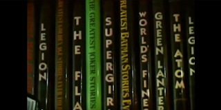
The next few shots as he says "There's nothing I love better..." focuses on the aesthetic of his room with a few dynamic shots. One of him playing with his dog, one showing his book collection and the other two showing memorabilia and collected items. The mid shot of his dog being pet is interesting, as it doesn't seem necessary but it provides a contrast from the shot of his face the scene centres around. The dog itself shows that Don is a respectable individual as he's able to support his hobby and what matters. The colour contrast between white and brown through the dog and floor leads me to label him as "ordinary", due to how non-special it is. This is to make it feel more authentic and provide a layer of comedy when the "mocking" elements kick in. The camera pans in the next shot to show off the book collection, books that feature memorable names. "The Flash", "Supergirl", "Green Lantern", all these names that sell the audience that this guy is a comic book fanatic. They understand Don's character from surroundings rather than interactions. The next shot of all the memorabilia also sells the audience on that because the amount of stuff there is massive. The panning of the camera is also useful for exploring the scale as it allows us to see more than what would fit in a initial still frame.

After returning to the original midshot, Don talks about how he has "Once Upon A Dime" with it turning onto the screen through a fade/zoom. The background turns into what I can only describe as a green/white mist, which is such a vibrant colour scheme that it echo's other comic book superheroes designs with two colours. Coming into the design of the actual fanfiction (originally made for this film, this isn't a real thing), it combines elements from other fanfic covers (simple design that draws inspiration for comics), comic book covers (title, issue number, main hero, the price in a specific outline) and plain awful elements (use of comic sans) to breed a certain sense of legitimacy into this cover, keeping this the audience in the illusion that this is a real thing. We then proceed to some very amateurish camera work as Don introduces the comic book store. The mise en scene shows an authentic looking store, but the camerawork isn't good quality at all, shaking, obviously hand held. While usually inexcusable, it works to the films favour as it brings in the feel that it's homemade, some amateurish video project, that it isn't a big thing. It looks mediocre, not only showing the average-ness of the main character, but also of the whole thing. This allows the film later on to play itself as the problem being bigger than the scale of the film, which means it's setting up the comedic elements even from the start.

A conversation is then shown between Don and who we assume are co-workers at his comic book store and once again, it comes off portraying him as a normal guy. The diegetic conversation is just general chit-chat, nothing special about it. It feels like something a normal friend group would talk about that is being filmed by an outsider, not a pro. The conversation goes in the typical nerdy way of ridiculous theories and ideas: in this case being about Spiderman having the web producing abilities of a normal arachnid and it can come off as relatable to an audience who find it fun asking those types of questions with their friends. It builds similarities and creates ideas an audience can relate to.
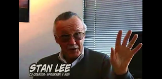
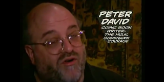
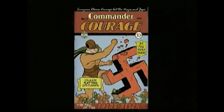
After a similar shot to "Once Upon A Dime", this time for "Commander Courage" (when Commander Courage gets shown, heroic music starts playing, showing that this will be the focus of the film), a wipe transition comes across to a close-up of Stan Lee talking about it, a man most people in the comic community know as one of the most important creators to the medium, (Marvel: co-creater of Spider-Man and Hulk, etc. The fact Stan Lee is talking about "Commander Courage" brings this vibe of that it's meant to be something serious even though it was created for the sole purpose of this film. However, this is where humour starts to show itself as what Stan Lee says about "saving America" and "making the world safe for comic books" seems completely out there. A similar scenario occurs with Peter David, another name in the comic industry, who says something that sounds normal first but ends with "wops on Hitler". It's an unexpected turn in both scenarios because you don't expect these big names to say something so out there and this creates comedy with how natural it sounds despite how wrong it is. The fact it's Stan Lee and Peter David however strives for this balance that "Commander Courage" is taken seriously in this film which contrasts with the hilarity of what they're saying. The latter of the two jokes is more hilarious because of the comic book cover that goes along with it, with Courage punching a Swastika with phrases around him like "Courage flattens Der Fuhrer!" and "The fall of the Third Reich!". It's so racist it becomes funny but it isn't offensive due to how it comes seemingly out of nowhere and its spoken by men who are known to be incredibly respectful guys.

Music starts kicking in towards the end of the last scene, which changes to cover the feelings of "Commander Courage" talked about next, changing from heroic to sinister. Sticking in this extreme territory, the next line starts with "in response to the tragedy of 9/11". This is the moment the audience realized they've been deceived thinking it'd be serious and these mocking elements are the focus. This is where they mention the revamp of Commander Courage named "Codename Courage" and they go all out with clichés of characters in other comic books. Starting off, "some sort of anti-terrorist" is the exception, because that goes hand in hand with the 9/11 joke. The name "Codename Courage" comes off as much more down to Earth and serious, like the dark themes reflected in more modern comics. These dark themes are also reflected in his redesign, which makes his costume completely black. This is a massive shot at a lot of revamps of comic books which change things into a stereotype which I can only describe as the Batman style. Main character who wants to fight on their own, anti-hero, dark colour schemes and usually tragic backstory. The film then proceeds to make fun of sidekick characters by changing "Liberty Lad" into "Liberty Lass". These are the two usual archetypes of sidekicks, either a younger kid like Robin, or a female of any age like Batgirl. In this scenario, both these character archetypes are played at extremes with "Liberty Lad" looking so similar to Robin and other characters of that archetype, while "Liberty Lass" is played up to have skin tight clothes, exposed areas, clearly sexualized which is probably a shot at how sexual some designs of heroines can be interpreted as like Wonder Woman and X-23. The character is then described as "edgy, ultra-violent and didn't even have a secret identity". Each of these features don't sound heroic at all, relating to the idea of anti-hero. These are all clichés of the media as I mention before, but the accuracy of how some are done lets the audience relate at least one comic book franchise with it, making them imagine how ridiculous the changes were creating personal comedy and for those who didn't, there was at least one joke that didn't need comic book knowledge, the 9/11 one. The fact it's then followed up by "the version that attracted Hollywood's attention" is then likely a shot at how all films adapted from comic books follow a dark broody version of the story, rather than more cheery ones. (See as a modern example, Man of Steel (2013), a modernized version of Superman) One thing I've noticed in particular with the editing of these images is that they're edited on basic levels, so transitions are simple and don't detract from the dialogue, it still looks amateurish which keeps up the feeling that its going to cover only a small problem.

Don then mentions his role in this, being invited to the San Diego Comicon. This wasn't a set, this was the genuine San Diego Comicon of 2002 and a lot of the film is filmed there. As such, it looks like a Comicon would be expected to look and its style of camerawork and editing matches it. Some speed-up, overall view of the area, mixture of medium, long and extreme long handheld shots. This allows the audience to believe the SDC as real even though "Courage" isn't, meaning they can imagine where this will go: people being involved with no idea of what's happening. That's a level of comedy being set up.
--------------------------------------------------------------------------------------------------------------------------
 
Comic Book the Movie's opening for me was pretty eye-opening, as it showed how the genre of a film impacts the overall quality required to make a good intro. With mysteries, you needed a sense of authenticity to get the audience involved. With mockumentaries, you just need to talk about something people want to hear about but make it amateurish production wise, and talk about the subject in a completely unexpected and unusual manner. The important thing is to not take it too seriously and if you can make it appear like it will be even thought it won't be, do. If things can make the audience go "What?", make them.

Friday, 8 January 2016

12th & 13th November - Memento Analysis

The third opening I'd be working on analysing is a film from 2000 called Memento. Going into this one, it's a little bit simple compared to the others in terms of things to talk about but it's not any less effective. https://www.youtube.com/watch?v=WHhlTXyBxPM
 -------------------------------------------------------------------------------------------------------------------------
The clips starts with a black screen, where credits fade on and off it for about thirty seconds without any change to the black screen. It allows a rather slow non-diegetic soundtrack to build it's way in but apart from that, it doesn't show you much. This is so the credits doesn't divert from the rest of the scene and adds build-up too. It allows for enough of the music to hit a rather high point by the time the background changes, a slow but effective payoff that a mystery film will use commonly to have a lighter start.

As the title fades on, the colour of it changes and it also gives an opportunity for the black background to crossfade with a close-up of a photo being held. Not only does this editing allow for a transition that feels relatively natural, but the changing of the text colour foreshadows the current scene. Even a slight premonition the viewer can get for something coming up from a clip is common of the mystery genre and it hints at the fact the audience need to pay attention and work things out for themselves. The photo is of a murder scene, as evidenced by the body and blood. This hints at the sub-genre of murder-mystery being prominent throughout the film, even from the beginning. This contrasts the pace with how quick the murder is being introduced with how slow the opening is.

The foreshadowing I just mentioned becomes apparent now with the same shot moved on a bit. The shot lasts a minute and a quarter with no edits apparent at the start. As a mystery film, it can be very subtle with the information it gives you and doesn't need to be explicit with it. The audience is expected to be able to work out things for themselves because it allows them to become more engrossed with what's going on in the plot. In terms of what's happening, we see the photo being shaken and it becomes less clear.
This doesn't make apparent sense at first, due to the nature of the photograph meaning that shaking it should be clearer. From an intellectual stand point, it seems like it was intended to confuse the reader but it can also serve as evidence. This contrasts ideas portrayed by Se7en with it's less in your face style and it's more unexplainable singular show. The lack of editing gives more time for the viewer to try and piece it together, giving them more of an easy start.

A tilt close-up then follows the photograph where it is put into a camera, it flashes indicating a photo has been taken, the camera is lowered and a man looks at what the photo was taken of. Those first two actions of this shot don't make sense logically unless you reverse the order of the entire scene so far. Man looks at murder, takes picture of it, takes it out of the camera and shakes it until it becomes clear. The entirety of this sequence is now clearly reversed and if you didn't pick it up from the picture clarity, this is your first indication of how the film is going to hide the mystery and make you think. Reversing the order of events shows you what has happened but not why they were caused, it makes you feel more like a witness at first before showing you exactly what made it like this. As such, you can make preliminary assumptions about the mystery from any evidence you see without being told who did it immediately. However, as the shot moves to his face, we do see blood on him. This means he's not a witness to the crime but rather an eye-witness. However, the fact he isn't reacting to potentially any other people in the room means he's the only one alive, not surprised by what he's seen, meaning he's likely the killer. This makes things interesting, as with most murder-mysteries we're meant to try and work out who's the killer, yet we're practically told in the first scene (made even more blatant in a second). As such, we realize this is where the films second genre comes in, psychological thriller. With the reversed shots and no real sense of a mystery to go on, we're left with a killer and I believe the mystery aspect comes from understanding this characters true nature. The mystery genre likes to combine with not only its various sub-genres but also other genres entirely, allowing its mystery to contain varied elements.
 
Blood is shown retracting in a extreme close-up tilted on its side followed by a close up of a single shell of a bullet on the ground. From this, a viewer can interpret that the murder is recent due to the reversed flow of blood and that the murder weapon was a pistol. We assume pistol due to there only being a lone shell on the ground. The use of these close-ups allows the audience to focus on a single piece of evidence without getting an information overload. However, the tilted shot can still make the viewer disorientated and unable to realize what the blood is at first as it appears to them that it's flowing upwards. Likewise, if the shot was in reverse, in chronological order, the blood would be flowing downwards simulating blood dripping, a common sight on a murder first being discovered, showing that the tilted shot has two reasons for existing. There's a couple similar shots after: a close-up of a bullet shell and bloody glasses with blood dripping on the walls. While not changed in anyway like the tilt, they provide vital evidence for the viewers to get an idea of what's happened, letting them piece together the murder for themselves before it's shown. The next shot contains a close-up of the back of the victims head and everything on the floor next to it. At this point, if the viewer hadn't figured it out this is where they would due to how blatantly explicit it is.
 
In the next shot, a pistol is seen flying into the hands of the killer and it tracks him as he crouches down, lining up the gun. Over the next couple of shots, the bullet and glasses are seen flying before the victims head comes up, the gun fires, the bloods gone and the victim screams. As you may be able to tell the sequence is reversed and the actual order of events are the man shoots the victim, the shell flies out, the glasses go to the floor, he stands up and throws the gun down. As the viewers reward for learning about the mystery, the genre trope allows for them to see how it all went down. However, it keeps to the clips theme of being in reverse and that makes the shot seem much cooler as it looks like he has something similar to the force when the gun seemingly flies into his hand. While he clearly doesn't have powers like this, it makes the audience question what this character can do. If he's able to kill a man in cold blood, what else is he willing to do? Does he have something mentally strange with him? Questions that won't be answered but the viewer yearns for them to be and they will be carried throughout the film. Despite one mystery having been solved, this tells the viewer that there is many more that need to be answered, setting up the premise for the entire movie.

Memento's opening carries the idea of hiding things in plain sight, but by a method very Brechtian, it was out of order and required some effort to be figured out. Key details were there, some were told but some were told oddly. However, the way it was able to hold a shot for 75 seconds shows that it was willing to go at it's own pace and that this would be the easy part.

Tuesday, 10 November 2015

6th November: Se7en Analysis

For these days, we were assigned to analyse another film opening sharing the genre of ours. This time, I went with the 1995 classic: "Se7en". https://www.youtube.com/watch?v=yALjuJcfg90
--------------------------------------------------------------------------------------------------------------------------
Long still shot is used to establish the importance of the character of Morgan Freeman despite his limited amount of actions in the scene. This shows that his role in the story will likely be of one of the mystery solvers due to his normal intentions throughout the scene. He isn't painted as suspicious. The ambient sound comes off as very normal as well. This doesn't reveal anything important to the story except the viewer likely getting interested in who this character is. The minimalistic established details is a common trope used within this genre.

A similar effect is achieved through this close-up arc shot moving from Morgan putting down glasses to hitting a metronome. Once again, minimalism paints a simple ideology about this character who we can distinguish as normal. The shots alternate between the metronome a slow zoom on Morgan's face. This is to show the calm normality of his life but to an almost "too perfect" degree. This is to foreshadow at something coming that will be "the mystery" and it while involve this character, either as a good guy or a victim. It cuts to black with a non-diegetic thunderclap in the background to transition to the actual opening sequence.

With no transition to speak of, it jumps into this book being turned. This is doesn't tell us a lot as due to how the focus is, we can't see what's on the pages and who's hand that is. The font used looks like it could've been hand printed, which makes you assume that there will be either a journalist or detective character as the protagonist, two character jobs that are common leads for this genre. The shaking of said font feels like a way of telling you things won't be straightforward, foreshadowing the nature of the narrative.

A straight cut transition is used to get to this part of the opening credits. The text being backwards at first but then switching around disorientates the audience which is commonly seen within this opening. Doing this allows the film to hide key details in front of the audience but they won't notice unless they specifically look for it. The text fades out a little but not completely and then disappears which seems like a really odd way to remove it, but it fits with the disorientating ideology. As it does, it is replaced by a high-angle shot of a sketch of two hands, both looking abnormal with what we can assume is a light swinging side to side and it's shadow being in view, a shot that also doesn't tell us anything of importance but it does ignite curiosity to the audience.

The transition from the last clip to this is shots of parts of a gun, three straight cuts to be precise, then going to another part of the credits. However, during those credits for a single frame, this appears. D-35 may seem like a meaningless number for now but it has a purpose. An audience member who sees that is going to remember that, is going to think it connects with the mystery. Regardless of whether the plot does have a detail relating to this number, it's a piece of evidence that may help the mystery genre fans to reach the conclusion on their own terms. However, it's followed by two frames of more scratches but unreadable and a white circle. This is to distract the viewer into focusing more on those because if they're only going to notice one, it'll be the less relevant one. D35 appears more times throughout the scene, along with the numbers 69 and C24 in different forms, hinting more at it's relevance.

The title appears after a few more non-explainable (at this point in the film) clips. However, the use of extreme close-ups on small sharp-looking metallic objects and the hands holding them hint towards these being evidence later down the line, potentially used within a killing later down the line. This is one of the first instances that it's hinted there will be a killing because of the nature of what we see, combined with the first spike in the non-diegetic soundtrack creating a threatening atmosphere, we are told this is what we want the characters to avoid. The title initially appears blurry and like there's two of them, changing size in one frame, being replaced by D35 and finally becoming readable at the intended place in the top right of the screen. This passively forces the audience to put more effort in to find the simplest of details, showing more of the films psychological elements.

After a few more unexplainable shots of similar nature, the way chosen to distract and disorientate the viewer was through layering a shot of someone writing under a semi-transparent shot of the same thing, but delayed, sped-up, something that made them desynchronise. The shot is a combination of a mid shot and a close-up, with what you want to learn about being a mid shot and what it tries to distract you with being a close-up. Along with abiding by the literature I mentioned earlier, it means there's nothing to be gained from the clip other than that. People will try and figure out significance behind it, like D35 but the layered clips mean you can't read the paper. Even in the next couple frames where it zooms in and flips the paper upside down, you see so little of it and it's broken up to the point of not making cohesive sense. This is to throw people off a trail they may be trying to work out, another common trope of the mystery genre. This may have relevance later in the film but if it's your first time, the nature of the evidence will need knowledge unobtainable. There's likely a code to it, unlike the numbers.

Before getting into this shot, I've noticed that a transition the clip appears to be fond of is semi-wipes. Part of the shot swipes on causing the next shot to appear as it goes by. This also leads to a disorientating effect while simultaneously moving the scene along. This is the brightest shot in the entirety of the opening also happens to be one of the most mysterious. You can't make out what the black shadow is in the red. However, the two colours do connote the idea of death, specifically due to the similar colouring to blood. This is one of the first times you may be able to piece together a narrative detail. With the blood connecting to a pre determined idea of killing and the films title being Se7en, the audience may start to think of the seven deadly sins. How this relates to murder at this point is unknown but when I think of "death" and "seven", this is what I come to. This thought process is common to the mystery genre because we reside an emotional affection to our theories and depending on the accuracy, we have a reaction later down the line.
Through the next few shots, we notice another type of transition, where it starts a clip while another one is going semi-transparent and then takes the old one away a few frames later. However, the frames disappear suddenly, throwing off the viewer to the point where they don't realize what's happening. They end up thinking there's more going on that there actually is.

A reoccurring clip used over the next few clips is varying lengths of shots of this newspaper article and someone highlighting certain words. Through the shot, we see the article is about sexuality in some way, through talk of pregnancy and the words "transsexual" and "heterosexual" being highlighted. This can be interpreted in many ways but it's most definitely evidence to character motivations. We can't tell anything yet but if we see any character connected to this theme, we know that there's likely an important relation between them and the story.
Photos are also shown through the many clips and could represent characters we haven't encountered yet. However, it could also be photos of the deceased, due to the fact they're in black and white. The photo's shown in that case are either evidence to the viewer or the characters, a unusual trope only the mystery genre can pull off. It's either evidence for the narrative or narrative structure. Depending on the character roles, these will help us tell who relevant to the story or who's a victim of the case. A lot of what the remainder of the scene does is reuse this assets in an inconsistent order, with different angles, points of focus, messages, etc. That's why it's hard to explain, you explain all the basic parts of it but it has no apparent meaning. That means the clip does a great job of conforming to genre trends, it keeps the audience in the dark.
The only particular point of interest I could find is this clip is this clip which shows a more interesting character. The type of character where you wouldn't be able to tell his name, who he is but you can identify his personality by his actions for these small frames. In these clips, we see dirty hands with peeling skin pulling out a nail from one of them. A nail that was inside the skin isn't exactly a natural occurrence and due to the size of it, it's not something that would get stuck that deep through an accident. It's safe to assume the character in question placed it inside his skin just to keep it on him. Not only is that a stupid idea due to the chance of infection but we can work out the nature of this character, psychopathic. As such, we assume he's the culprit in whatever case we find the plot delves into and anything for the remainder of the opening sequence shown with those hands we assume connect to him.
This begs a big question. Who's perspective is this opening from? Due to the nature of the evidence being shown in evidence form, we could assume it's from the detectives, the protagonist, but with scenes like this with signs of an insane character, we could argue for it being from the perspective of the killer, the antagonist. Either way, this question along with the rest of the opening work wonders for the genre because they do what the mystery genre does best. Makes a mystery. There are more question than answers even though you can work out some of them yourself and it engages the audience while disorientating and distracting them from the bigger picture through sound and editing. The clues are there but that's the easy part.
--------------------------------------------------------------------------------------------------------------------------
Through analysing this clip, I've learnt that a key element to making my mystery opening successful is creative freedom. I must be able to make evidence to a bigger plot in the opening there but using editing I must throw people off what it means. Everything must be unexplainable for everything to have meaning.