The next film I'm analysing is not a mystery film but rather its a Mockumentary. The reason for this is because at this point I was starting to feel I didn't see mystery as the best option for me and I didn't want to not have all my heart in it because that would be visible in the final product, while with a mockumentary it allows me to take a different approach with a bigger focus on comedic elements that can be combined with others like mystery, if doing a "conspiracy" theory, and parody, all in the form of a documentary. As such, I wanted to research other mockumentaries to see what they do to achieve this effect and hopefully, be able to integrate similar ideas into my final product.
The opening of a mockumentary is interesting, as a lot of them have titles and then get on with the big thing, while some don't even have titles. As such, determining a stopping point is hard but what I classify the opening as is the point where initial exposition ends. We get an amount of backstory on what we're going to be watching, and that's our intro.
--------------------------------------------------------------------------------------------------------------------------

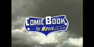 The film starts off with the scene of clouds sped-up moving in the back with text fading in and out across the centre before the title swoops in. Comic Book The Movie doesn't just talk about comic books, it directly parodies their style and this intro is very reminiscent of other comic book to film adaptations namely from the clouds and the sinister music, something that doesn't fit the tone of the film but matches the theme it covers. The credits also bring that vibe with the bold yellow colouring with a light black outline and shading, the boldness primarily reminding me of other superhero titles and even of the onomatopoeia seen to simulate action in comics. It also looks similar to the Comicon logo in terms of colours, shade and font. The music quickly contrasts as the title flies on screen into a sort of child-like tune complete with slapstick sound effects as parts of it fly on to it. This change says to me that the film understands how these superhero stories made kids feel and this showed the transition. These stories filled with hardship and struggle made children admire and happy, they wanted to be these heroes and the music reflects the optimism of these kids. The logo vaguely reminisces the Batman logo, yet another reference to an established franchise. Contrasting blue and white also relates to the cloud background due to the sky and clouds colouring, which could potentially represents how free you feel with this hobby, which in turn could be ironic due to how costly the hobby of being a comic book fan actually is. The text looks more dynamic as once it appears, the logo rotates, zooms in and swipes to change scene, the 3D-animation making the film seem grand, like any superhero film.
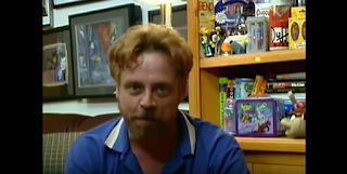 After the title swipes away, we're left with a camera shot of a man sitting down and telling us who he is, Don Swan. The mid-shot at a constant angle is very reminiscent of a vlog, where someone videos their life for entertainment purposes. The blue and white colour scheme comes back due to his shirt, which shows the link between comic books and Don, if that wasn't made obvious by his monologue and the Mise en Scene where you can see iconic comic book memorabilia, eg: "Duff" from The Simpsons. From the introduction, very direct look at him, etc, we can tell that the documentary will centre around him.
  It then goes to a couple still images separated by a fade. The first zooms out from the lower right corner, the second zooming out from centre. As this happens, Don is describing comic strips he obtained during his childhood which is a cliché of mockumentaries, the backstory is told as exposition rather than told as a story. The use of still images is reminiscent of internet vlogs because generally in vlogs, when a person mentions something they'll occasionally have an image up so people understand what they're talking about. These images are in black and white, which captures the "back-in-the-old-days" feel, which shows Don's experience with the media, meaning the audience has a bigger trust in this persons words.
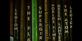
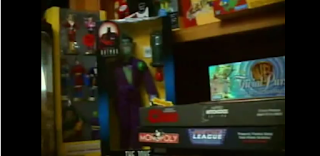 The next few shots as he says "There's nothing I love better..." focuses on the aesthetic of his room with a few dynamic shots. One of him playing with his dog, one showing his book collection and the other two showing memorabilia and collected items. The mid shot of his dog being pet is interesting, as it doesn't seem necessary but it provides a contrast from the shot of his face the scene centres around. The dog itself shows that Don is a respectable individual as he's able to support his hobby and what matters. The colour contrast between white and brown through the dog and floor leads me to label him as "ordinary", due to how non-special it is. This is to make it feel more authentic and provide a layer of comedy when the "mocking" elements kick in. The camera pans in the next shot to show off the book collection, books that feature memorable names. "The Flash", "Supergirl", "Green Lantern", all these names that sell the audience that this guy is a comic book fanatic. They understand Don's character from surroundings rather than interactions. The next shot of all the memorabilia also sells the audience on that because the amount of stuff there is massive. The panning of the camera is also useful for exploring the scale as it allows us to see more than what would fit in a initial still frame.
  After returning to the original midshot, Don talks about how he has "Once Upon A Dime" with it turning onto the screen through a fade/zoom. The background turns into what I can only describe as a green/white mist, which is such a vibrant colour scheme that it echo's other comic book superheroes designs with two colours. Coming into the design of the actual fanfiction (originally made for this film, this isn't a real thing), it combines elements from other fanfic covers (simple design that draws inspiration for comics), comic book covers (title, issue number, main hero, the price in a specific outline) and plain awful elements (use of comic sans) to breed a certain sense of legitimacy into this cover, keeping this the audience in the illusion that this is a real thing. We then proceed to some very amateurish camera work as Don introduces the comic book store. The mise en scene shows an authentic looking store, but the camerawork isn't good quality at all, shaking, obviously hand held. While usually inexcusable, it works to the films favour as it brings in the feel that it's homemade, some amateurish video project, that it isn't a big thing. It looks mediocre, not only showing the average-ness of the main character, but also of the whole thing. This allows the film later on to play itself as the problem being bigger than the scale of the film, which means it's setting up the comedic elements even from the start.
A conversation is then shown between Don and who we assume are co-workers at his comic book store and once again, it comes off portraying him as a normal guy. The diegetic conversation is just general chit-chat, nothing special about it. It feels like something a normal friend group would talk about that is being filmed by an outsider, not a pro. The conversation goes in the typical nerdy way of ridiculous theories and ideas: in this case being about Spiderman having the web producing abilities of a normal arachnid and it can come off as relatable to an audience who find it fun asking those types of questions with their friends. It builds similarities and creates ideas an audience can relate to.
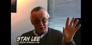
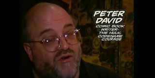
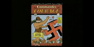 After a similar shot to "Once Upon A Dime", this time for "Commander Courage" (when Commander Courage gets shown, heroic music starts playing, showing that this will be the focus of the film), a wipe transition comes across to a close-up of Stan Lee talking about it, a man most people in the comic community know as one of the most important creators to the medium, (Marvel: co-creater of Spider-Man and Hulk, etc. The fact Stan Lee is talking about "Commander Courage" brings this vibe of that it's meant to be something serious even though it was created for the sole purpose of this film. However, this is where humour starts to show itself as what Stan Lee says about "saving America" and "making the world safe for comic books" seems completely out there. A similar scenario occurs with Peter David, another name in the comic industry, who says something that sounds normal first but ends with "wops on Hitler". It's an unexpected turn in both scenarios because you don't expect these big names to say something so out there and this creates comedy with how natural it sounds despite how wrong it is. The fact it's Stan Lee and Peter David however strives for this balance that "Commander Courage" is taken seriously in this film which contrasts with the hilarity of what they're saying. The latter of the two jokes is more hilarious because of the comic book cover that goes along with it, with Courage punching a Swastika with phrases around him like "Courage flattens Der Fuhrer!" and "The fall of the Third Reich!". It's so racist it becomes funny but it isn't offensive due to how it comes seemingly out of nowhere and its spoken by men who are known to be incredibly respectful guys.


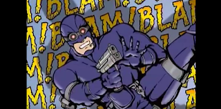 Music starts kicking in towards the end of the last scene, which changes to cover the feelings of "Commander Courage" talked about next, changing from heroic to sinister. Sticking in this extreme territory, the next line starts with "in response to the tragedy of 9/11". This is the moment the audience realized they've been deceived thinking it'd be serious and these mocking elements are the focus. This is where they mention the revamp of Commander Courage named "Codename Courage" and they go all out with clichés of characters in other comic books. Starting off, "some sort of anti-terrorist" is the exception, because that goes hand in hand with the 9/11 joke. The name "Codename Courage" comes off as much more down to Earth and serious, like the dark themes reflected in more modern comics. These dark themes are also reflected in his redesign, which makes his costume completely black. This is a massive shot at a lot of revamps of comic books which change things into a stereotype which I can only describe as the Batman style. Main character who wants to fight on their own, anti-hero, dark colour schemes and usually tragic backstory. The film then proceeds to make fun of sidekick characters by changing "Liberty Lad" into "Liberty Lass". These are the two usual archetypes of sidekicks, either a younger kid like Robin, or a female of any age like Batgirl. In this scenario, both these character archetypes are played at extremes with "Liberty Lad" looking so similar to Robin and other characters of that archetype, while "Liberty Lass" is played up to have skin tight clothes, exposed areas, clearly sexualized which is probably a shot at how sexual some designs of heroines can be interpreted as like Wonder Woman and X-23. The character is then described as "edgy, ultra-violent and didn't even have a secret identity". Each of these features don't sound heroic at all, relating to the idea of anti-hero. These are all clichés of the media as I mention before, but the accuracy of how some are done lets the audience relate at least one comic book franchise with it, making them imagine how ridiculous the changes were creating personal comedy and for those who didn't, there was at least one joke that didn't need comic book knowledge, the 9/11 one. The fact it's then followed up by "the version that attracted Hollywood's attention" is then likely a shot at how all films adapted from comic books follow a dark broody version of the story, rather than more cheery ones. (See as a modern example, Man of Steel (2013), a modernized version of Superman) One thing I've noticed in particular with the editing of these images is that they're edited on basic levels, so transitions are simple and don't detract from the dialogue, it still looks amateurish which keeps up the feeling that its going to cover only a small problem.
  Don then mentions his role in this, being invited to the San Diego Comicon. This wasn't a set, this was the genuine San Diego Comicon of 2002 and a lot of the film is filmed there. As such, it looks like a Comicon would be expected to look and its style of camerawork and editing matches it. Some speed-up, overall view of the area, mixture of medium, long and extreme long handheld shots. This allows the audience to believe the SDC as real even though "Courage" isn't, meaning they can imagine where this will go: people being involved with no idea of what's happening. That's a level of comedy being set up.
--------------------------------------------------------------------------------------------------------------------------
Comic Book the Movie's opening for me was pretty eye-opening, as it showed how the genre of a film impacts the overall quality required to make a good intro. With mysteries, you needed a sense of authenticity to get the audience involved. With mockumentaries, you just need to talk about something people want to hear about but make it amateurish production wise, and talk about the subject in a completely unexpected and unusual manner. The important thing is to not take it too seriously and if you can make it appear like it will be even thought it won't be, do. If things can make the audience go "What?", make them.
